Elevating the earner experience
A new visual language for our heatmap

Mohini Vora
Staff Product Designer
25 March 2026
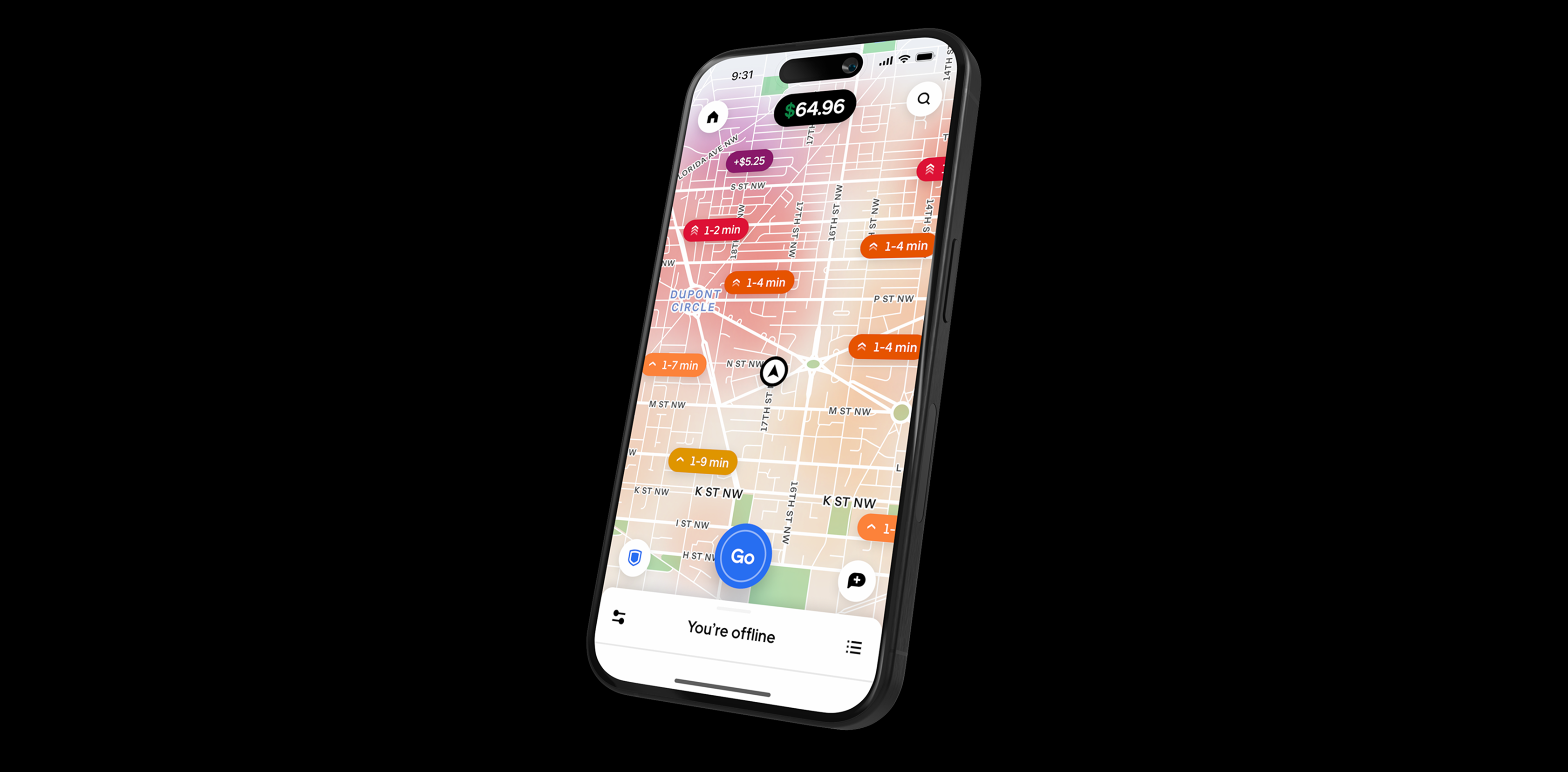
The Earner app's heatmap is a critical utility, providing real-time data that empowers earners to make informed decisions about when, where, and how to earn. However, user research (UXR) and feedback from our crew sessions highlighted a key design challenge: a lack of visual clarity, with the old map being described as having "dark grey clouds" and needing stronger signal articulation.
This fall, our design team addressed this directly by launching a new, intentional heatmap design. We shifted the visual aesthetic to a much more impactful warm color spectrum, creating a clearer visual hierarchy powered by our new wait-time technology.
Key design elements include:
- Intuitive Color Palette: A red-orange-yellow gradient is employed to represent predicted wait times. The warmer the color, the shorter the wait, immediately communicating crucial information to the earner.
- Distinct Iconography: Surge areas are clearly delineated using consistent purple icons for immediate recognition.
- Focused Utility: The new design integrates a dedicated delivery heatmap, utilizing icons to clearly mark real-time hotspots at busy stores and restaurants, further enhancing utility across all earning modes.
This user-centered iteration has been lauded by earners globally, reinforcing its success as our most effective heatmap design to date. The design innovation was recently featured by leadership at Only on Uber 2025.
We led this effort from concept through launch, collaborating closely with partners across design, research, and product. Together we built alignment across orgs, defined a clear north star vision, and iterated relentlessly through prototypes, testing, and workshops. What launched was more than a redesign—it was a renewed platform for innovation. With a reimagined home, inbox, and menu, the new system has already improved feature discoverability, deepened engagement, and inspired org-wide adoption as the model for future driver experiences.
More of our work
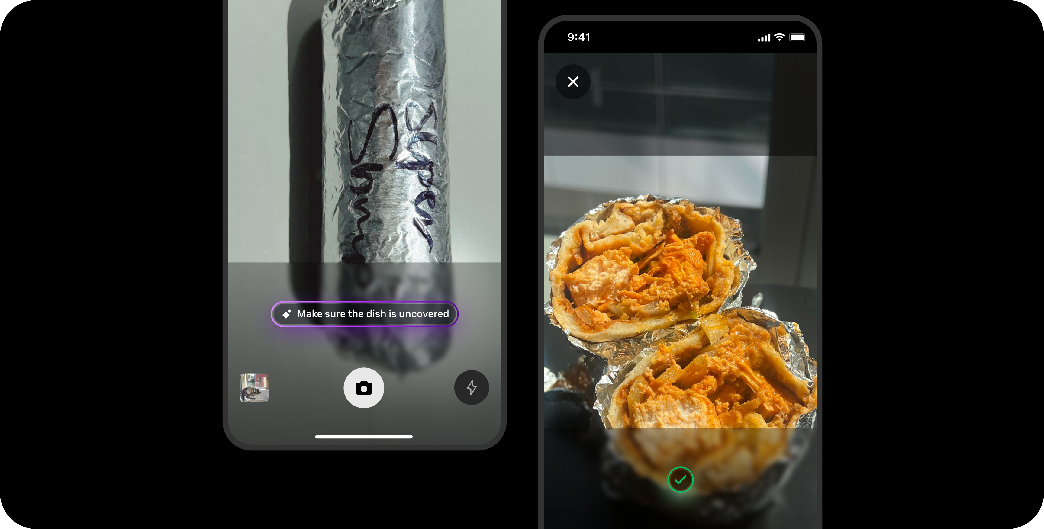
Designing for smart food photography
Real-time feedback that brings clarity, confidence, and quality to user photos
View work


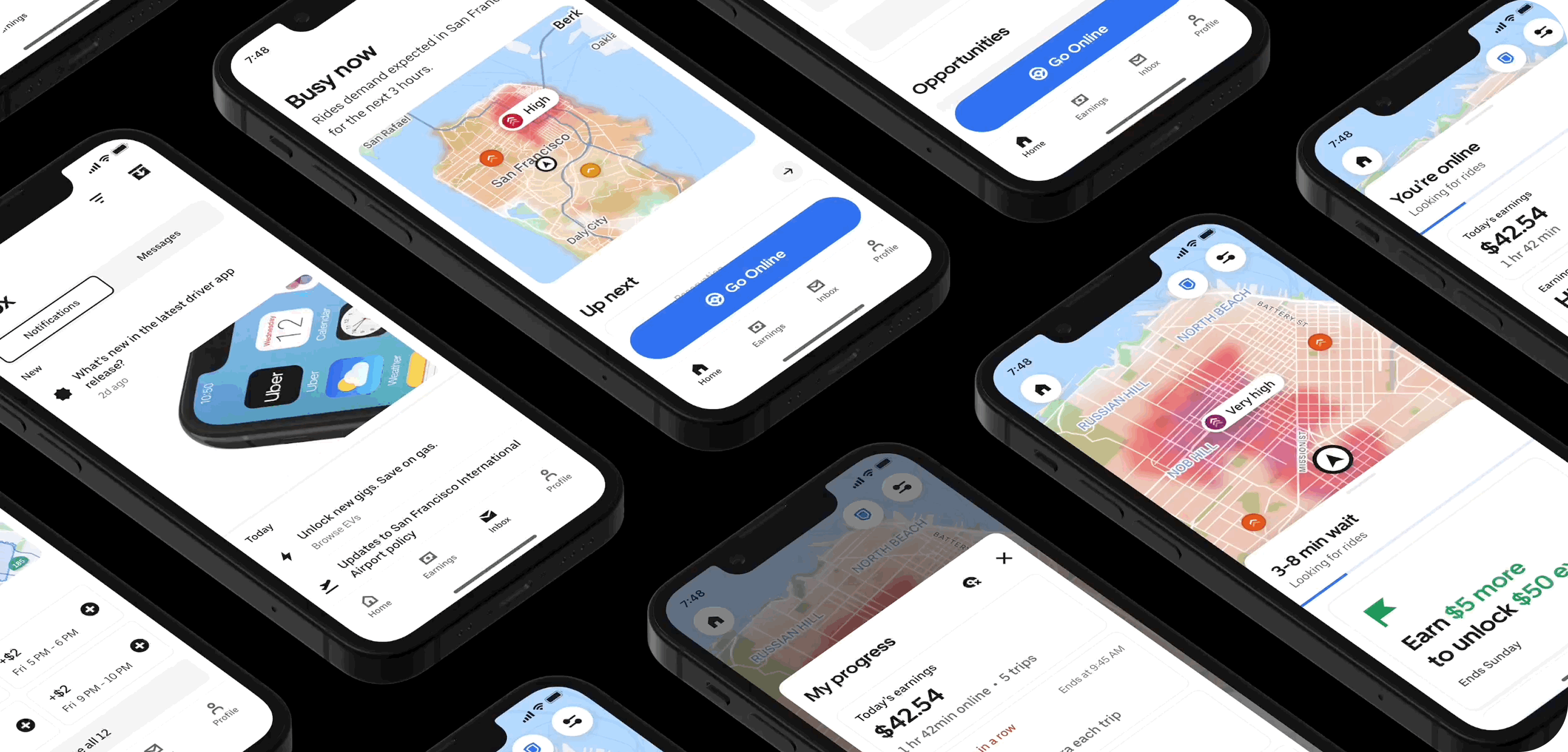
Reimagining the driver experience
How a design-led initiative brought focus, clarity, and confidence back to the Driver app
View work
Launching our new icon set
How we build clarity, accessibility, and trust across Uber’s global platform — one icon at a time
View work
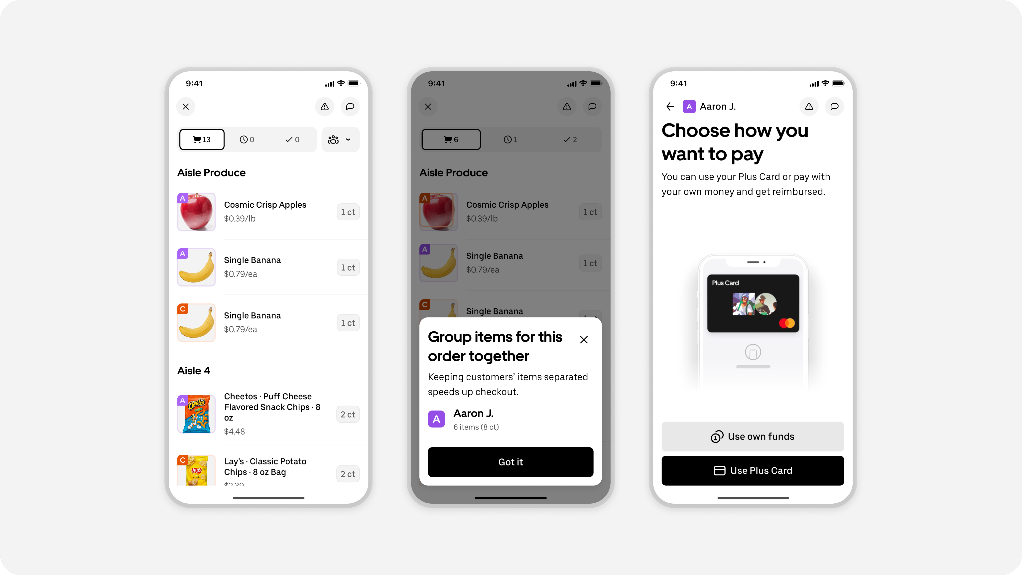
Designing batched shopping orders
Redesigning shopping trips to enable a batched experience for earners
View work
Design Specs, Reimagined
How Uber Built an Agentic System to Automate Design Specs in Minutes
View work
Uber Design
2026 © Uber Technologies Inc.


Elevating the earner experience
A new visual language for our heatmap
Mohini Vora
Staff Product Designer
25 March 2026
The Earner app's heatmap is a critical utility, providing real-time data that empowers earners to make informed decisions about when, where, and how to earn. However, user research (UXR) and feedback from our crew sessions highlighted a key design challenge: a lack of visual clarity, with the old map being described as having "dark grey clouds" and needing stronger signal articulation.
This fall, our design team addressed this directly by launching a new, intentional heatmap design. We shifted the visual aesthetic to a much more impactful warm color spectrum, creating a clearer visual hierarchy powered by our new wait-time technology.
Key design elements include:
- Intuitive Color Palette: A red-orange-yellow gradient is employed to represent predicted wait times. The warmer the color, the shorter the wait, immediately communicating crucial information to the earner.
- Distinct Iconography: Surge areas are clearly delineated using consistent purple icons for immediate recognition.
- Focused Utility: The new design integrates a dedicated delivery heatmap, utilizing icons to clearly mark real-time hotspots at busy stores and restaurants, further enhancing utility across all earning modes.
This user-centered iteration has been lauded by earners globally, reinforcing its success as our most effective heatmap design to date. The design innovation was recently featured by leadership at Only on Uber 2025.
We led this effort from concept through launch, collaborating closely with partners across design, research, and product. Together we built alignment across orgs, defined a clear north star vision, and iterated relentlessly through prototypes, testing, and workshops. What launched was more than a redesign—it was a renewed platform for innovation. With a reimagined home, inbox, and menu, the new system has already improved feature discoverability, deepened engagement, and inspired org-wide adoption as the model for future driver experiences.
More of our work
Designing for smart food photography
Real-time feedback that brings clarity, confidence, and quality to user photos
View work
Reimagining the driver experience
How a design-led initiative brought focus, clarity, and confidence back to the Driver app
View work
Launching our new icon set
How we build clarity, accessibility, and trust across Uber’s global platform — one icon at a time
View work
Designing batched shopping orders
Redesigning shopping trips to enable a batched experience for earners
View work
Design Specs, Reimagined
How Uber Built an Agentic System to Automate Design Specs in Minutes
View work
Uber Design
2026 © Uber Technologies Inc.
Elevating the earner experience
A new visual language for our heatmap
Mohini Vora
Staff Product Designer
25 March 2026
The Earner app's heatmap is a critical utility, providing real-time data that empowers earners to make informed decisions about when, where, and how to earn. However, user research (UXR) and feedback from our crew sessions highlighted a key design challenge: a lack of visual clarity, with the old map being described as having "dark grey clouds" and needing stronger signal articulation.
This fall, our design team addressed this directly by launching a new, intentional heatmap design. We shifted the visual aesthetic to a much more impactful warm color spectrum, creating a clearer visual hierarchy powered by our new wait-time technology.
Key design elements include:
- Intuitive Color Palette: A red-orange-yellow gradient is employed to represent predicted wait times. The warmer the color, the shorter the wait, immediately communicating crucial information to the earner.
- Distinct Iconography: Surge areas are clearly delineated using consistent purple icons for immediate recognition.
- Focused Utility: The new design integrates a dedicated delivery heatmap, utilizing icons to clearly mark real-time hotspots at busy stores and restaurants, further enhancing utility across all earning modes.
This user-centered iteration has been lauded by earners globally, reinforcing its success as our most effective heatmap design to date. The design innovation was recently featured by leadership at Only on Uber 2025.
We led this effort from concept through launch, collaborating closely with partners across design, research, and product. Together we built alignment across orgs, defined a clear north star vision, and iterated relentlessly through prototypes, testing, and workshops. What launched was more than a redesign—it was a renewed platform for innovation. With a reimagined home, inbox, and menu, the new system has already improved feature discoverability, deepened engagement, and inspired org-wide adoption as the model for future driver experiences.
More of our work
Designing for smart food photography
Real-time feedback that brings clarity, confidence, and quality to user photos
View work
Reimagining the driver experience
How a design-led initiative brought focus, clarity, and confidence back to the Driver app
View work
Launching our new icon set
How we build clarity, accessibility, and trust across Uber’s global platform — one icon at a time
View work
Designing batched shopping orders
Redesigning shopping trips to enable a batched experience for earners
View work
Design Specs, Reimagined
How Uber Built an Agentic System to Automate Design Specs in Minutes
View work
Uber Design
2026 © Uber Technologies Inc.