Designing batched shopping orders
Redesigning shopping trips to enable a batched experience for earners

Pushkar Joshi
Lead Product Designer
25 March 2026
We began offering grocery delivery in 2020, starting with basic items like avocados and bananas. Today, couriers deliver everything from makeup to large electronics like TVs. Shoppers are the backbone of this growth. When Uber is designing for the shopper experience, there are crucial considerations. We want to make it easier for shoppers to find things in the store throughout hundreds of aisles, and we need to ensure the couriers have the right type of vehicle to deliver the amount of items
Scaling Shop and Pay: When we launched Shop & Pay, an earnings opportunity in the Driver app, it was a single-trip structure. It restricted shoppers to handling one order at a time. While simple, this approach created significant inefficiencies at scale.
Inefficient Use of Time: Shoppers spent a disproportionate amount of time driving between their home, the store, and the customer, often repeating trips to the same merchant. Shoppers couldn't complete multiple orders at once, even if they were at the same store. This critically limited their earning potential, making it harder to attract and keep outstanding shoppers.
Delay and Cancellation: The single-order constraint meant available shoppers were often already tied up with other deliveries. This led to a bottleneck in order acceptance and matching, frequently resulting in delays for customers or, in the worst cases, cancellations.
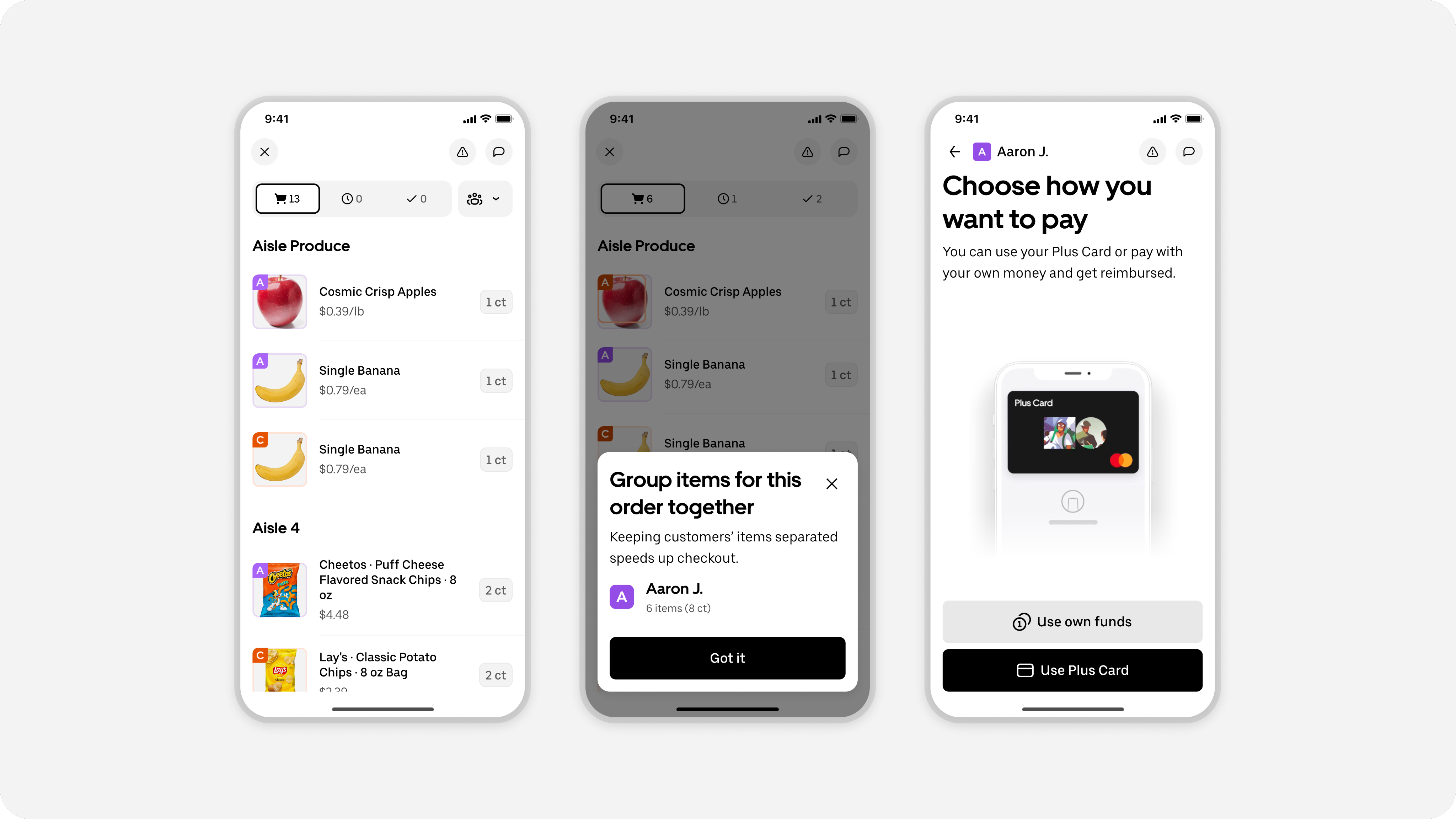
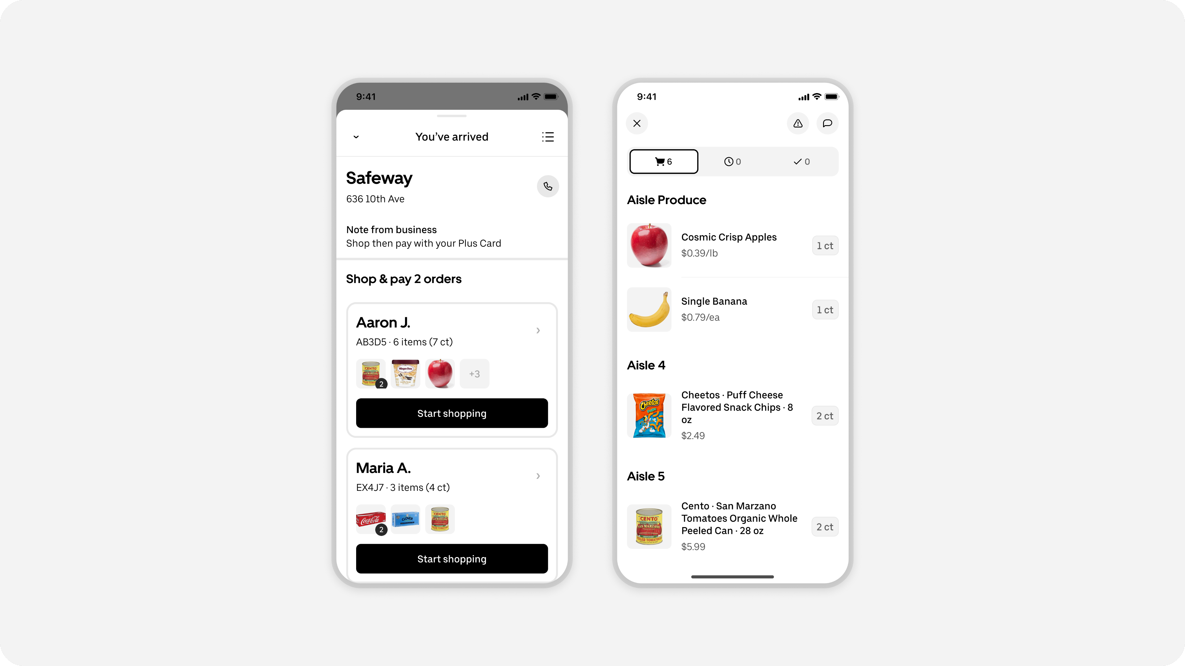
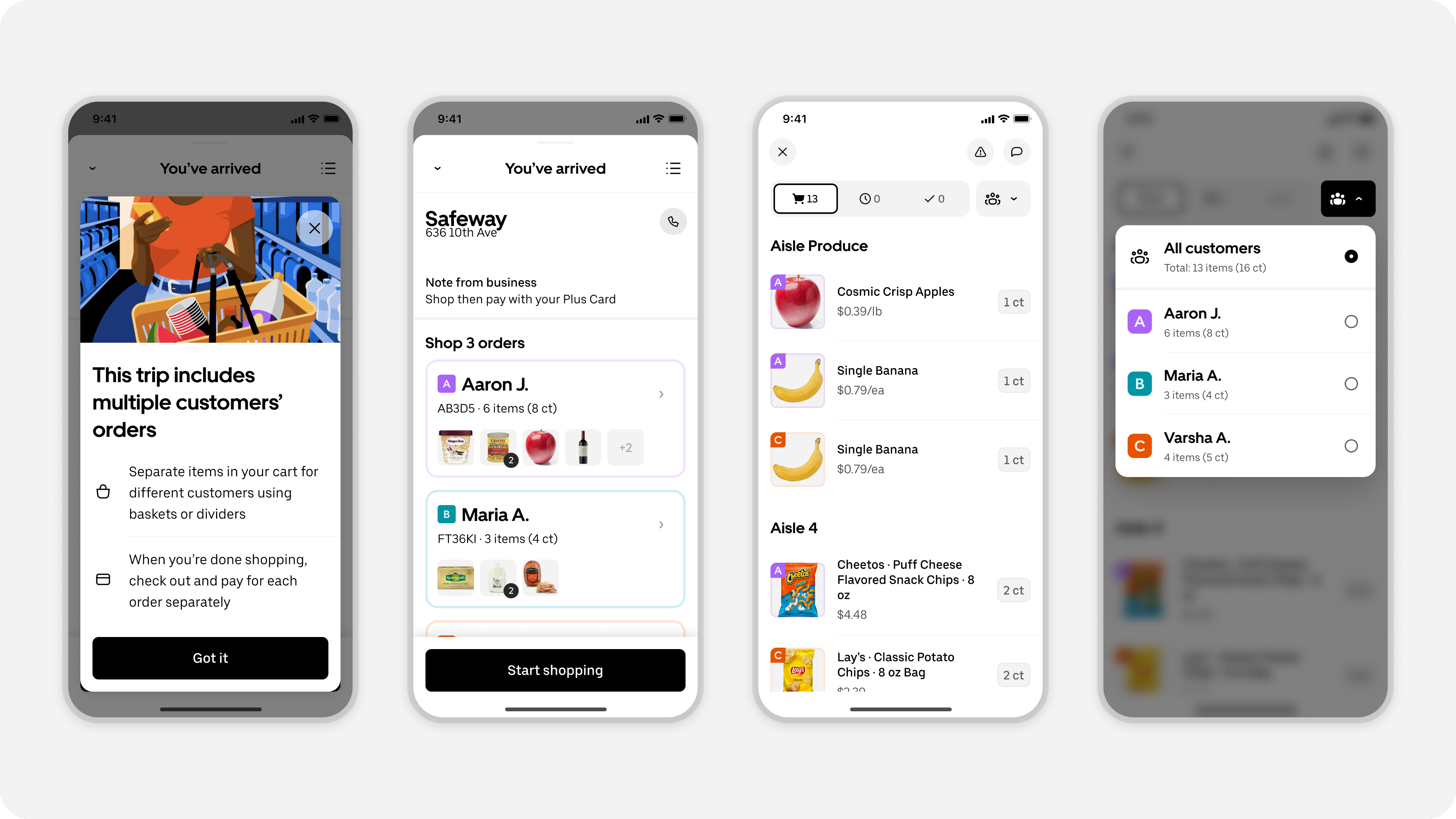
Launching batched orders: We tackled these systemic issues by introducing batched orders. This new standard allows a single shopper to handle and deliver up to three separate orders from the same store in one combined trip.
Navigating the tradeoff of shipping fast vs shipping right
This was a complex project to undertake, demanding significant design engineering investment and cross-functional collaboration across several teams. It meant an estimated launch timeline of over six months, but we wanted to improve the experience for shoppers as quickly as we could.
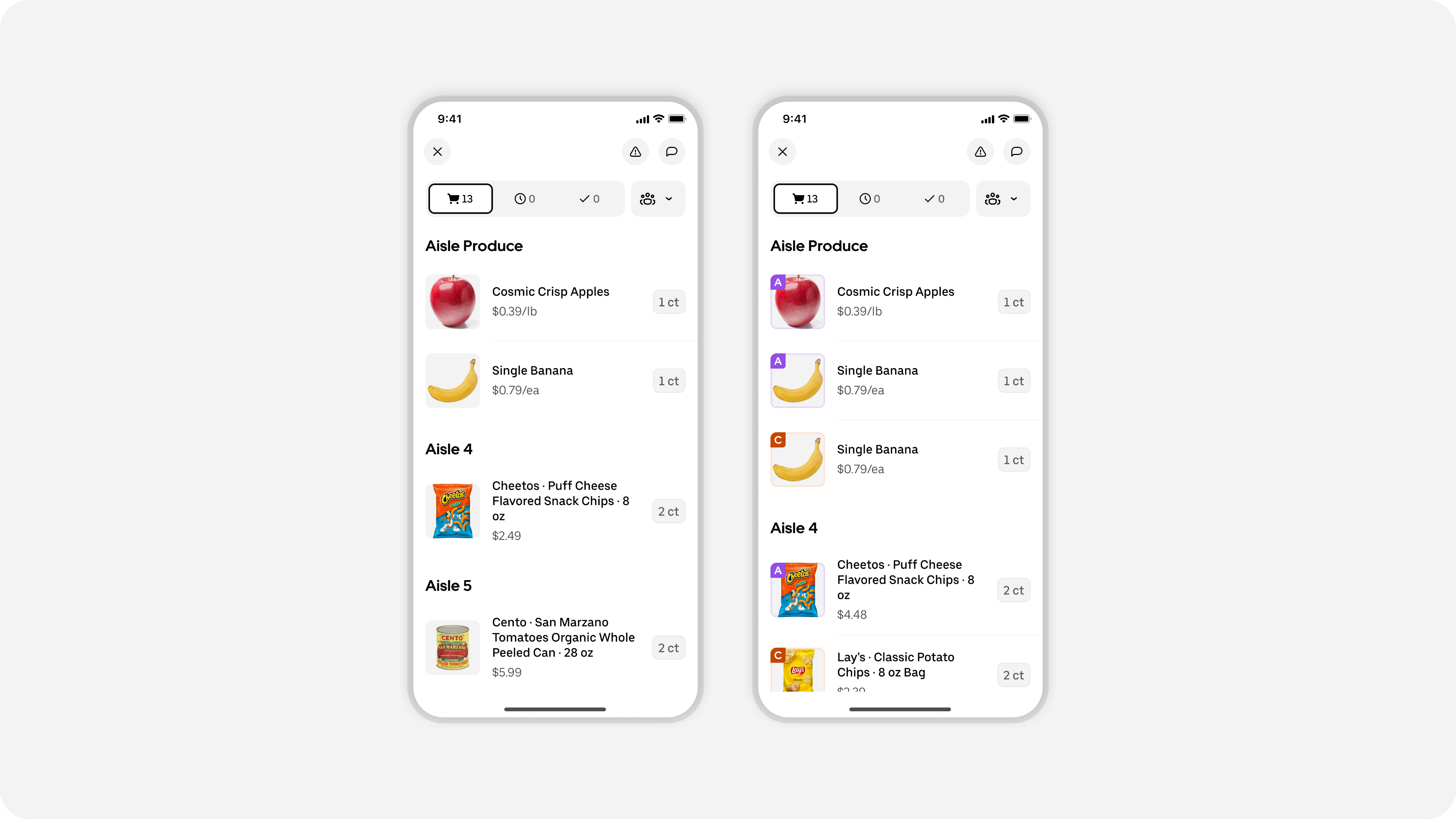
One major decision was whether to batch multiple orders with a merged shopping list or to keep the lists separate for the initial release. Given our technical architecture at the time, keeping lists separate would have been faster. Although we explored end-to-end designs for both options, the Design team already knew that separate lists could lead to a poor experience for the shopper. They would either complete one order fully before starting the next, causing them to walk the entire store twice, or they would constantly switch between screens to minimize backtracking. The better option was clear.
A merged shopping list was the right experience, even if changing direction would delay the project. We presented both options to leadership and strongly advocated for the merged list. They fully supported our proposal, even with the extended timeline.
Order identifiers
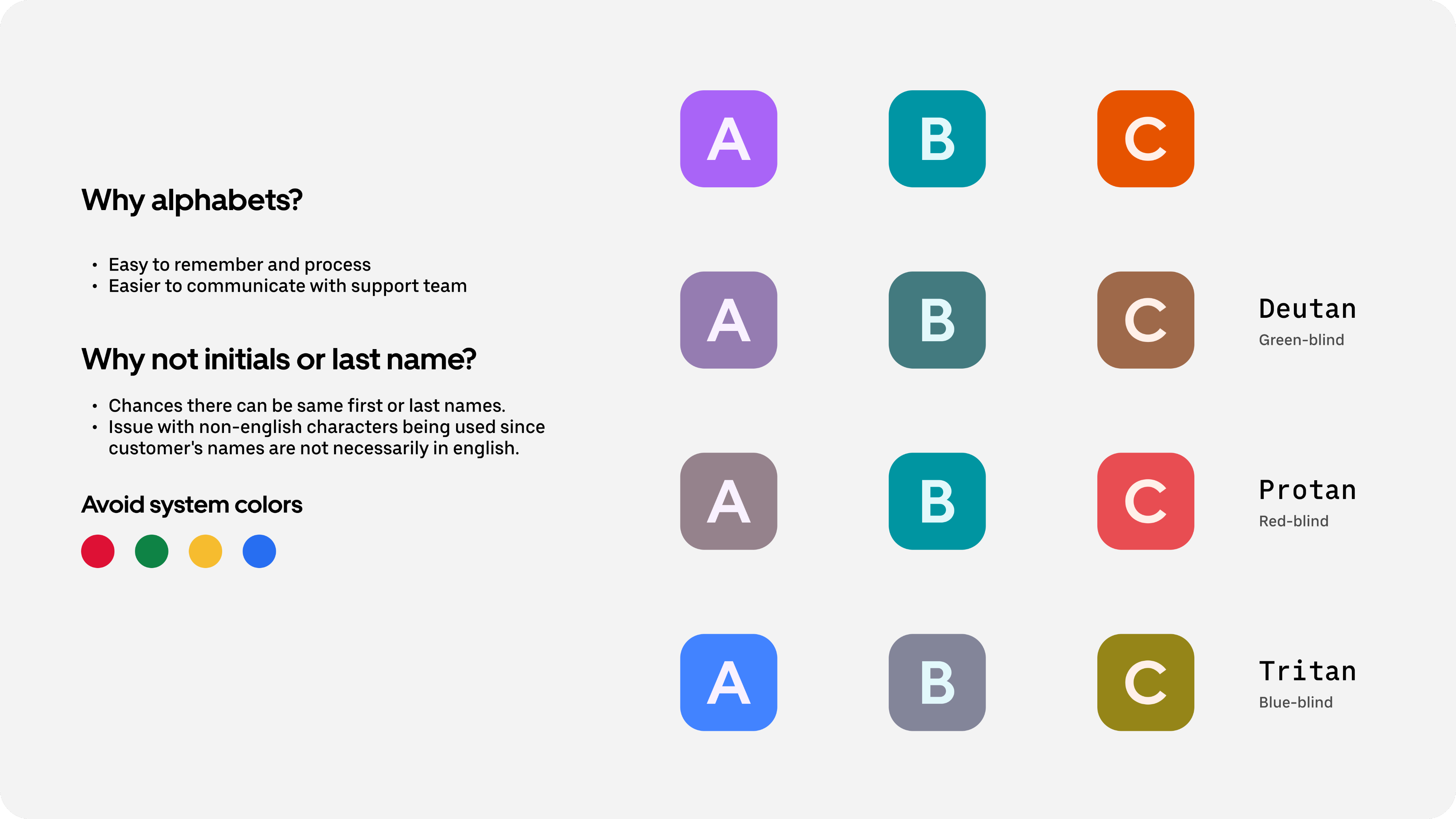
Merging shopping lists introduced its own challenges. If two customers ordered the same item, how would the shopper know which one belonged to which customer so they could pack items separately? To address this, we introduced order identifiers, a combination of a letter and a unique color. We chose letters because they’re easy to remember and simple to share with Support if needed. For colors, we were intentional about avoiding system colors that imply positive or negative meanings. We selected neutral tones that also remained accessible for people with various types of color blindness.
Results
This enhancement to batching represents a meaningful win for shoppers. It removes redundant trips to the same store and significantly optimizes the time spent shopping across multiple orders. As a result, shoppers can complete more deliveries in less time, leading to a notable increase in earning potential.
For customers, this means reduced wait and overall delivery times. It also helps by enhancing shopper efficiency and availability, which is particularly valuable during peak hours. Ultimately, our design allows a more consistent and dependable experience for everyone.
More of our work
Designing for smart food photography
Real-time feedback that brings clarity, confidence, and quality to user photos
View work


Designing for smart food photography
Real-time feedback that brings clarity, confidence, and quality to user photos
View work
Elevating the earner experience
A new visual language for our heatmap
View work
Launching our new icon set
How we build clarity, accessibility, and trust across Uber’s global platform — one icon at a time
View work

Design Specs, Reimagined
How Uber Built an Agentic System to Automate Design Specs in Minutes
View work
Uber Design
2026 © Uber Technologies Inc.


Designing batched shopping orders
Redesigning shopping trips to enable a batched experience for earners
Pushkar Joshi
Lead Product Designer
25 March 2026
We began offering grocery delivery in 2020, starting with basic items like avocados and bananas. Today, couriers deliver everything from makeup to large electronics like TVs. Shoppers are the backbone of this growth. When Uber is designing for the shopper experience, there are crucial considerations. We want to make it easier for shoppers to find things in the store throughout hundreds of aisles, and we need to ensure the couriers have the right type of vehicle to deliver the amount of items
Scaling Shop and Pay: When we launched Shop & Pay, an earnings opportunity in the Driver app, it was a single-trip structure. It restricted shoppers to handling one order at a time. While simple, this approach created significant inefficiencies at scale.
Inefficient Use of Time: Shoppers spent a disproportionate amount of time driving between their home, the store, and the customer, often repeating trips to the same merchant. Shoppers couldn't complete multiple orders at once, even if they were at the same store. This critically limited their earning potential, making it harder to attract and keep outstanding shoppers.
Delay and Cancellation: The single-order constraint meant available shoppers were often already tied up with other deliveries. This led to a bottleneck in order acceptance and matching, frequently resulting in delays for customers or, in the worst cases, cancellations.
Launching batched orders: We tackled these systemic issues by introducing batched orders. This new standard allows a single shopper to handle and deliver up to three separate orders from the same store in one combined trip.
Navigating the tradeoff of shipping fast vs shipping right
This was a complex project to undertake, demanding significant design engineering investment and cross-functional collaboration across several teams. It meant an estimated launch timeline of over six months, but we wanted to improve the experience for shoppers as quickly as we could.
One major decision was whether to batch multiple orders with a merged shopping list or to keep the lists separate for the initial release. Given our technical architecture at the time, keeping lists separate would have been faster. Although we explored end-to-end designs for both options, the Design team already knew that separate lists could lead to a poor experience for the shopper. They would either complete one order fully before starting the next, causing them to walk the entire store twice, or they would constantly switch between screens to minimize backtracking. The better option was clear.
A merged shopping list was the right experience, even if changing direction would delay the project. We presented both options to leadership and strongly advocated for the merged list. They fully supported our proposal, even with the extended timeline.
Order identifiers
Merging shopping lists introduced its own challenges. If two customers ordered the same item, how would the shopper know which one belonged to which customer so they could pack items separately? To address this, we introduced order identifiers, a combination of a letter and a unique color. We chose letters because they’re easy to remember and simple to share with Support if needed. For colors, we were intentional about avoiding system colors that imply positive or negative meanings. We selected neutral tones that also remained accessible for people with various types of color blindness.
Results
This enhancement to batching represents a meaningful win for shoppers. It removes redundant trips to the same store and significantly optimizes the time spent shopping across multiple orders. As a result, shoppers can complete more deliveries in less time, leading to a notable increase in earning potential.
For customers, this means reduced wait and overall delivery times. It also helps by enhancing shopper efficiency and availability, which is particularly valuable during peak hours. Ultimately, our design allows a more consistent and dependable experience for everyone.
More of our work
Designing for smart food photography
Real-time feedback that brings clarity, confidence, and quality to user photos
View work
Reimagining the driver experience
How a design-led initiative brought focus, clarity, and confidence back to the Driver app
View work
Elevating the earner experience
A new visual language for our heatmap
View work
Launching our new icon set
How we build clarity, accessibility, and trust across Uber’s global platform — one icon at a time
View work
Design Specs, Reimagined
How Uber Built an Agentic System to Automate Design Specs in Minutes
View work
Uber Design
2026 © Uber Technologies Inc.