When to evolve a design system
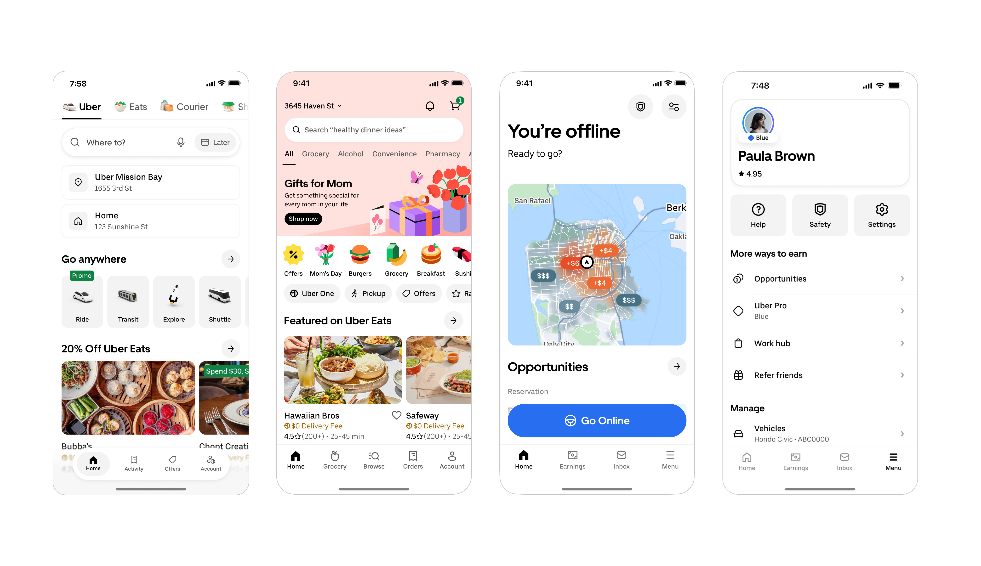
Rebuilding Uber’s icon language

Samira Rahimi
Group Product Design Manager, Base
25 March 2026
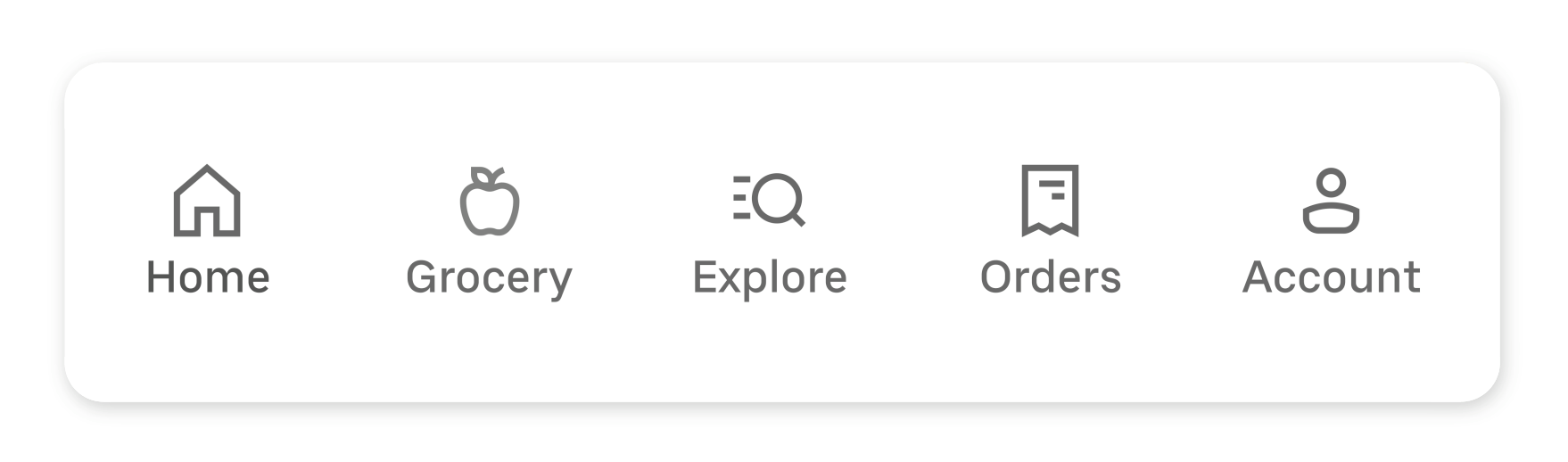
Every day, millions of people navigate Uber’s apps with the help of icons. They may be small, but they play an important role in the interface: ensuring clarity, helping riders find their way, keeping drivers informed, and letting customers follow their orders. When they work well, they create clarity, continuity, and trust across the experience. When that breaks down, the signal becomes impossible to ignore.
Over the past year, our Base design system team turned those signals into action, rebuilding Uber’s icon library to restore clarity, accessibility, and consistency across our global platform, while creating a more scalable visual language and a stronger design-to-code pipeline.
The language of navigation
Think about the last time you opened an app in a hurry. You didn’t read. You scanned. You looked for icons, colors, and familiar cues to get where you needed to go.
But for some users, icons aren’t just a shortcut, they’re the primary way to understand what’s happening and what to do next. A clear icon sets the right expectation and carries the entire meaning of an interaction without relying on text. Just a shape that says: go here, tap this, you’re on track. When that clarity breaks down, the people who rely on icons most are the first ones left behind.
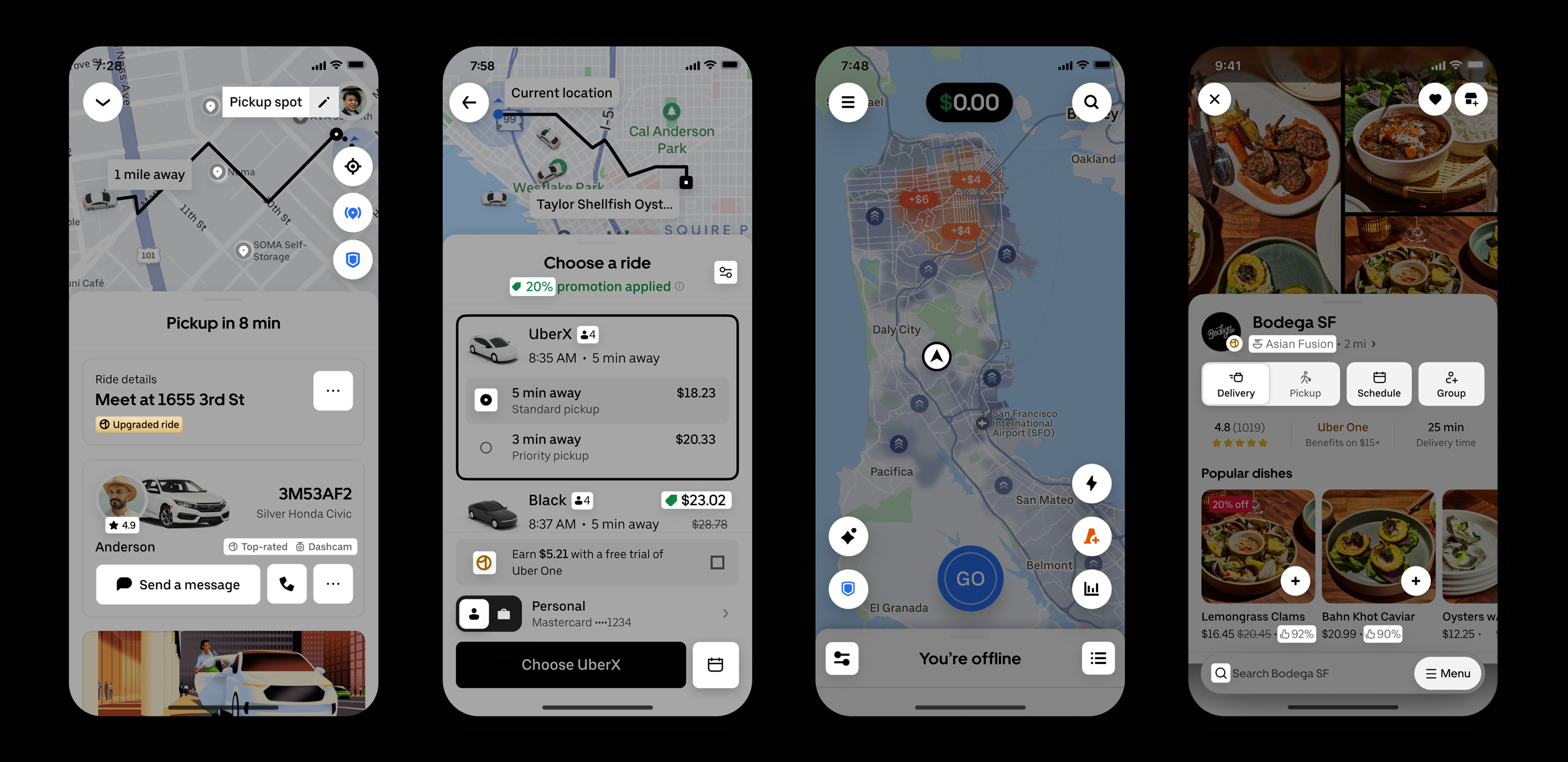
Uber’s bold, minimal brand once relied on a tightly crafted icon set featuring 3px outlines, sharp corners, and a confident, geometric rhythm. It served us well for years. But as our products grew and new use cases emerged, what once worked beautifully began to show its limits at scale.
Listening to the signal
One of the hardest questions in design systems is knowing when it’s time to evolve. Our view is simple: when two or more products begin to diverge from the system, it’s no longer drift—it’s feedback. And that’s when the system team needs to listen and act.
The scaling challenge
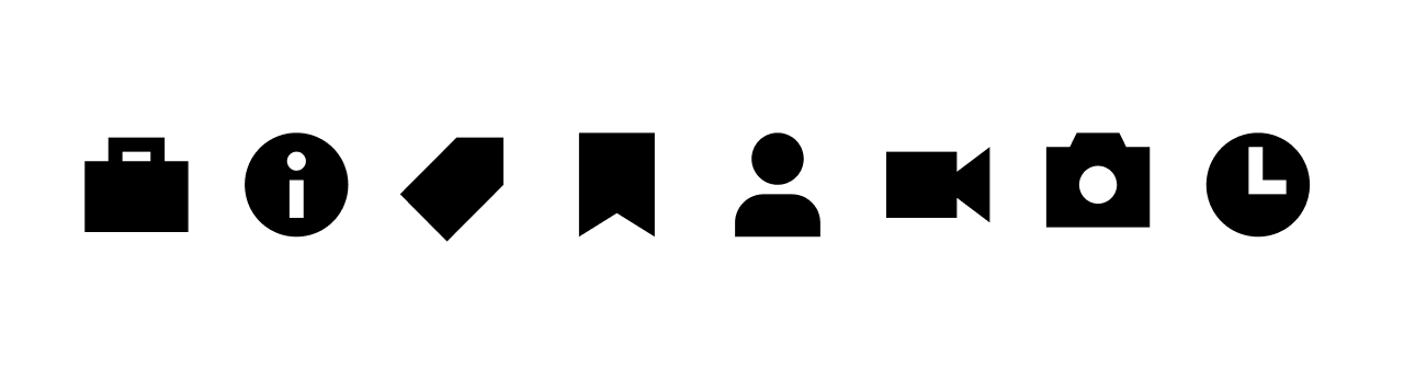
As the company grew, new products, features, and platforms demanded hundreds of additional icons. At that scale, the limitations of our 3px outline style became impossible to ignore. There simply weren’t enough pixels to express complex ideas with precision. Details became cramped, shapes lost clarity, and icons began to feel heavy on screen.
To preserve legibility, we leaned into filled icons as the default. They offered more control and visual clarity. But over time, relying on a single filled style introduced new accessibility challenges, especially when distinguishing between default and selected states. Because Uber’s brand color is black, the state change relied on shifting from gray to black, a contrast too subtle for many users to notice.
Some apps continued using only filled icons, while others reverted to outlines as their default. Over time, consistency, and the trust it builds, started to fray. When two of our biggest products began speaking different visual languages, we knew a small adjustment wouldn’t be enough.
At that point, the signal was impossible to ignore: this wasn’t a tweak, it was a redesign. The scope was massive, but the goal was clear. We decided to start fresh—not just to adjust stroke thickness, but to give our icons a shared voice again, one that felt lighter, clearer, more open, and built to scale across every journey at Uber.
A shared voice
The goal was about defining a visual language that could scale with Uber. Inspired by our very own Uber Move typeface, we wanted icons and typography to feel like they belonged to the same family. They should be clear, confident, and unmistakably Uber. We began to think of them as two expressions of one visual alphabet. The typeface’s sharp structure, open counters, and generous use of space gave us a direction: create icons that felt lighter, more breathable, and more at ease across the growing breadth of Uber’s products.

To translate that direction into a system, we defined a set of core principles:
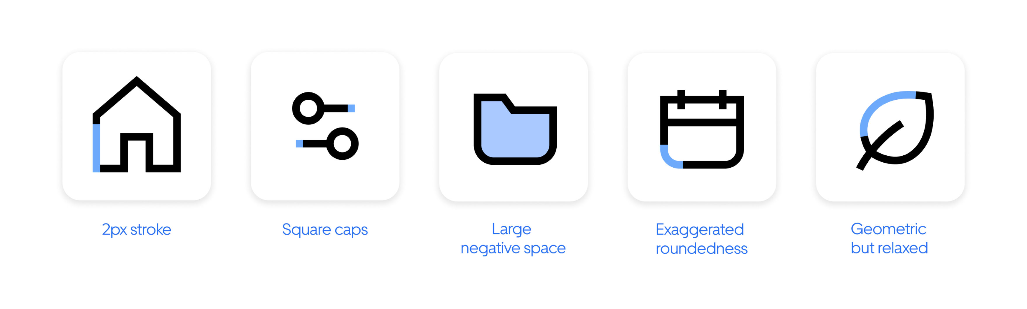
- 2px stroke weight for a lighter visual presence and more refined detail
- Square stroke caps to echo the crisp precision of our type
- Generous negative space to create a more breathable, balanced structure
- Exaggerated roundness to turn corners into a distinctive design feature
- A geometric foundation softened with gentle curves where needed
- Organic forms, where appropriate, to better express modern digital experiences
This is more than a style update. We resolved long-standing accessibility challenges by defining a precise relationship between filled and outlined states, sharpening both quality and clarity for all kinds of users.
The unified direction scales across our entire portfolio, closing the gap between divergent styles and eliminating technical debt.
Production at scale
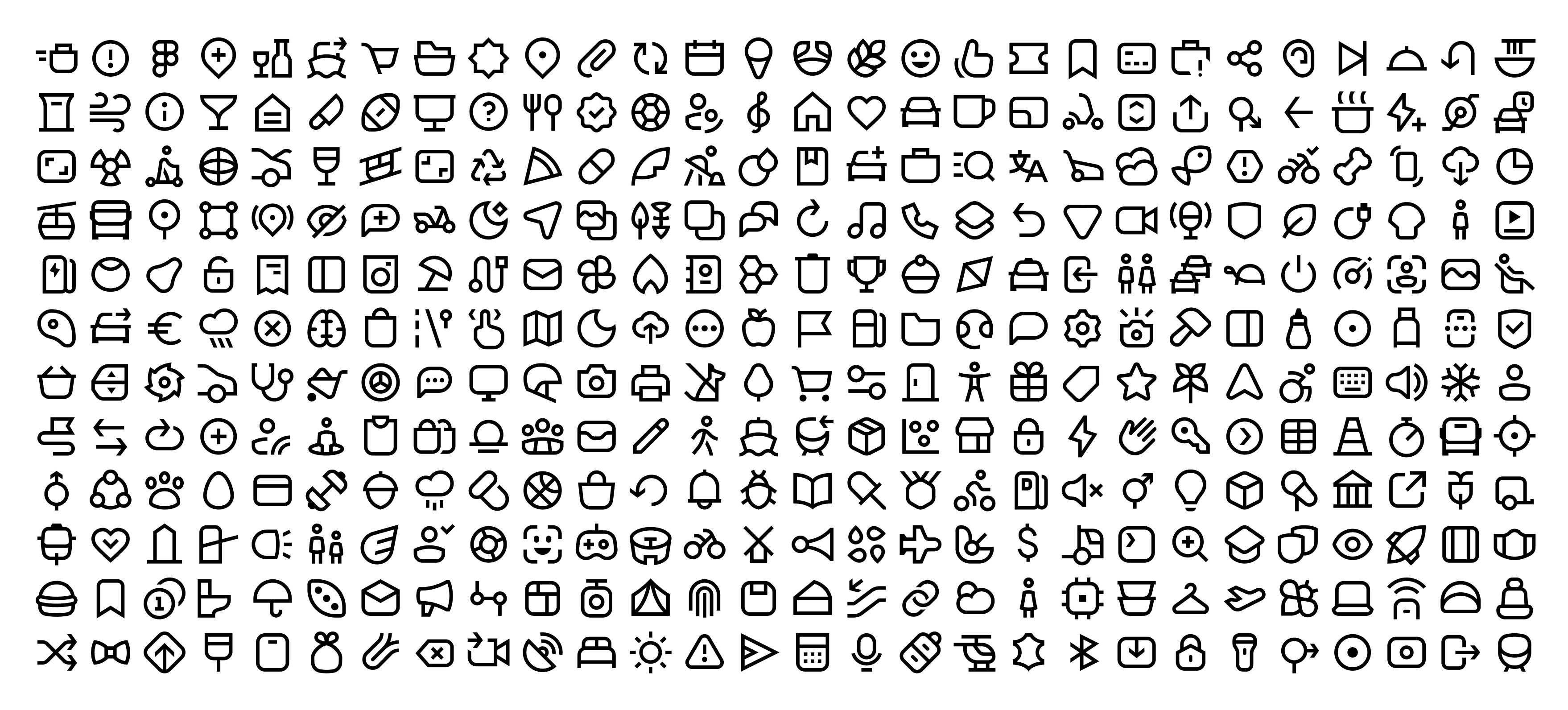
Then came the heavy lifting: A massive effort to redesign 1,500 icons in under four months. We built a new library, introduced a consistent naming and sizing system, and developed detailed guidelines for creation and use.
Most importantly, we developed the tooling to make updates seamless across design files and code, a core strength of our team at Uber. Seeing a single cohesive icon system come to life across our apps was a moment of joy, and a reminder that design systems succeed when we listen. When two products drifted apart, it wasn’t failure, it was feedback. It helped us rebuild with more empathy, scalability, and precision.
Our key takeaways
Seeing a single cohesive icon system come to life across our apps was a moment of joy, and a reminder that design systems succeed when they listen. When two products drifted apart, it wasn’t a failure. It was feedback. And that feedback helped us rebuild with more empathy, more precision, and a clearer understanding of what scale demands.
This work left us with four principles we'll carry forward:
- Design to scale. What feels bold and distinctive across 50 icons today must remain legible and flexible when the library grows to 1,500 and beyond. Build for where you're going, not just where you are.
- Design for clarity. Treat icons as a universal visual language that helps people navigate the world around them, every shape should earn its place by making the next step obvious. Clarity leads to confidence and builds trust.
- Design for accessibility. Diverse needs aren't edge cases. Keep users’ needs at the center.
- Design with data. Ground guidelines in real-world learning, not assumptions, just as our Driver team did by testing legibility in context instead of relying on instinct alone.
I’ve always believed that good design should be practical, serve the business, be accessible, and be beautiful, and that none of those should come at the expense of another. It’s a difficult balance, but that’s the job. This project was our effort to hold all of those together, and I believe the team delivered.
This project was our effort to hold all of those together, and I believe the team delivered.
Because in the end, good iconography doesn’t just decorate and describe movement, it powers it.
More of our work
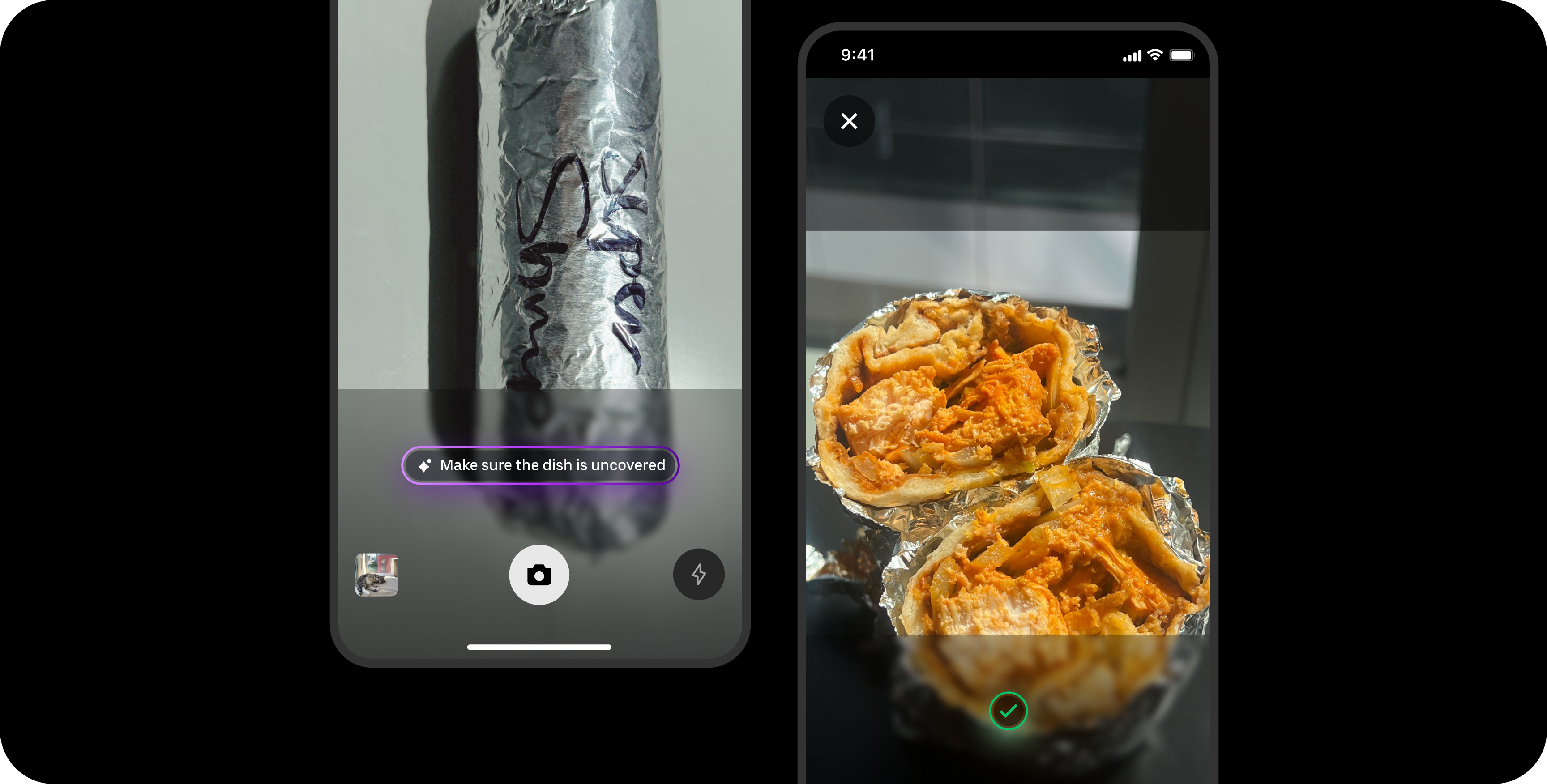
Designing for smart food photography
Real-time feedback that brings clarity, confidence, and quality to user photos
View work


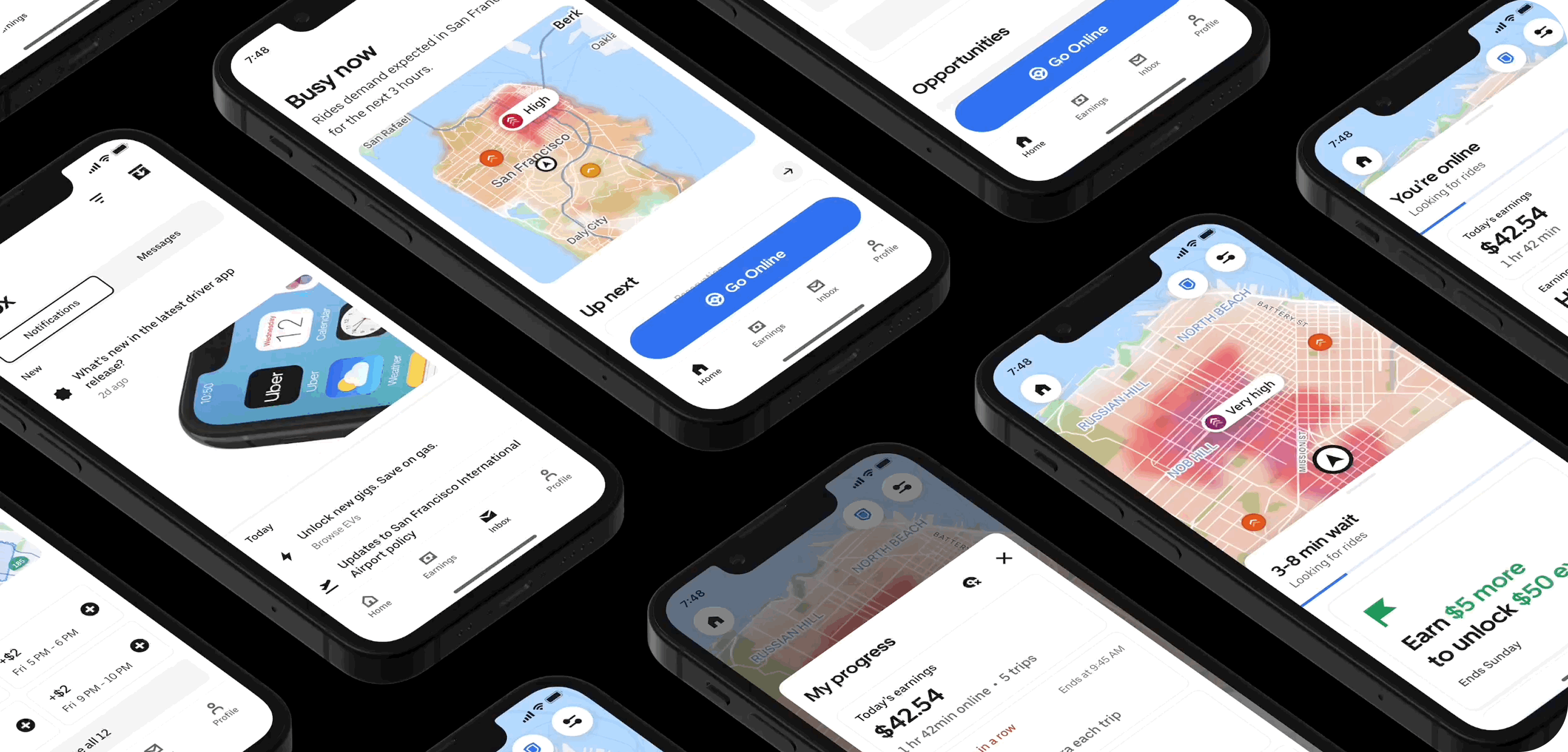
Reimagining the driver experience
How a design-led initiative brought focus, clarity, and confidence back to the Driver app
View work
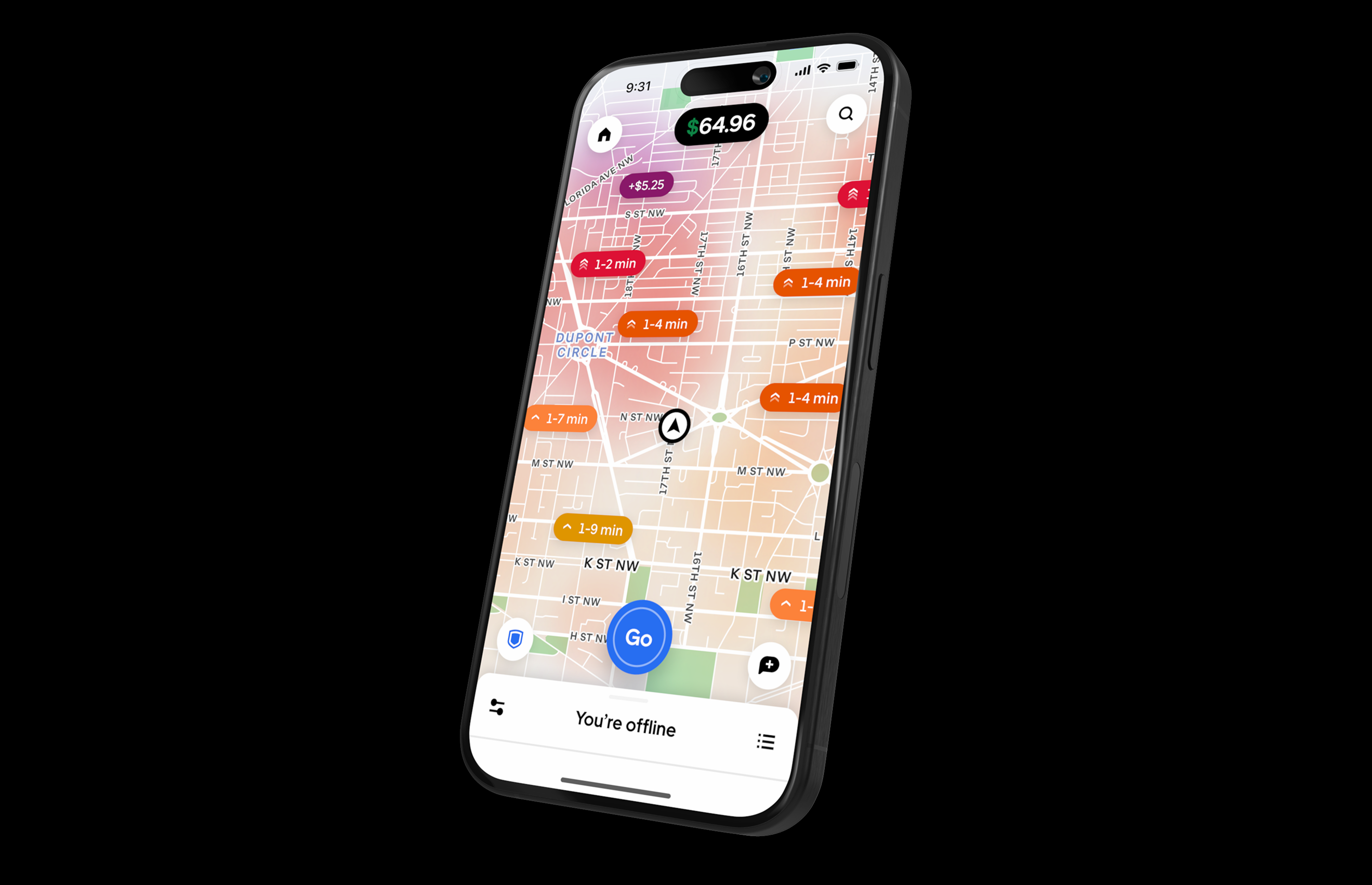
Elevating the earner experience
A new visual language for our heatmap
View work
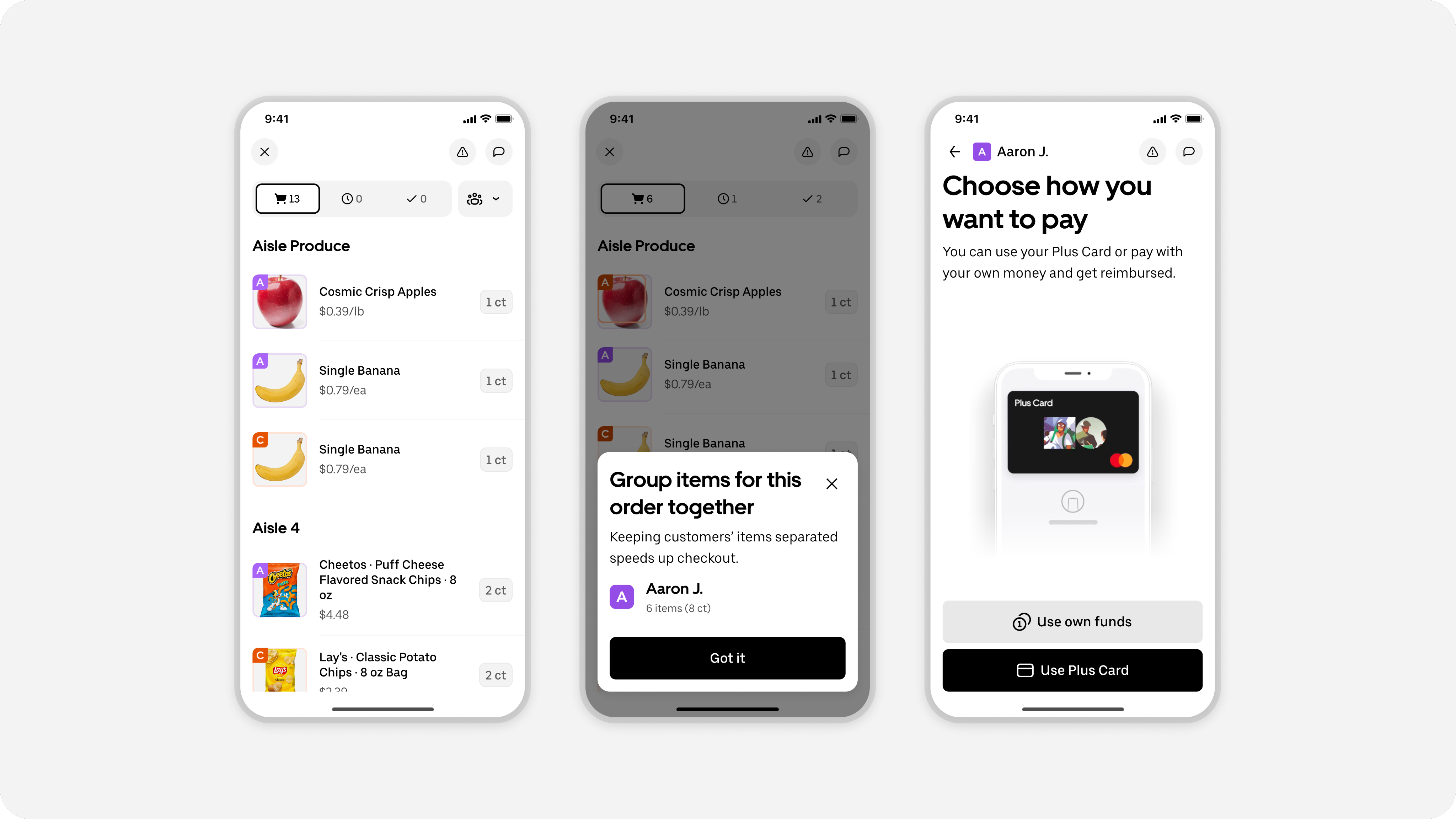
Designing batched shopping orders
Redesigning shopping trips to enable a batched experience for earners
View work
Design Specs, Reimagined
How Uber Built an Agentic System to Automate Design Specs in Minutes
View work
Uber Design
2026 © Uber Technologies Inc.


When to evolve a design system
Rebuilding Uber’s icon language
Samira Rahimi
Group Product Design Manager, Base
25 March 2026
Every day, millions of people navigate Uber’s apps with the help of icons. They may be small, but they play an important role in the interface: ensuring clarity, helping riders find their way, keeping drivers informed, and letting customers follow their orders. When they work well, they create clarity, continuity, and trust across the experience. When that breaks down, the signal becomes impossible to ignore.
Over the past year, our Base design system team turned those signals into action, rebuilding Uber’s icon library to restore clarity, accessibility, and consistency across our global platform, while creating a more scalable visual language and a stronger design-to-code pipeline.
The language of navigation
Think about the last time you opened an app in a hurry. You didn’t read. You scanned. You looked for icons, colors, and familiar cues to get where you needed to go.
But for some users, icons aren’t just a shortcut, they’re the primary way to understand what’s happening and what to do next. A clear icon sets the right expectation and carries the entire meaning of an interaction without relying on text. Just a shape that says: go here, tap this, you’re on track. When that clarity breaks down, the people who rely on icons most are the first ones left behind.
Uber’s bold, minimal brand once relied on a tightly crafted icon set featuring 3px outlines, sharp corners, and a confident, geometric rhythm. It served us well for years. But as our products grew and new use cases emerged, what once worked beautifully began to show its limits at scale.
Listening to the signal
One of the hardest questions in design systems is knowing when it’s time to evolve. Our view is simple: when two or more products begin to diverge from the system, it’s no longer drift—it’s feedback. And that’s when the system team needs to listen and act.
The scaling challenge
As the company grew, new products, features, and platforms demanded hundreds of additional icons. At that scale, the limitations of our 3px outline style became impossible to ignore. There simply weren’t enough pixels to express complex ideas with precision. Details became cramped, shapes lost clarity, and icons began to feel heavy on screen.
To preserve legibility, we leaned into filled icons as the default. They offered more control and visual clarity. But over time, relying on a single filled style introduced new accessibility challenges, especially when distinguishing between default and selected states. Because Uber’s brand color is black, the state change relied on shifting from gray to black, a contrast too subtle for many users to notice.
Some apps continued using only filled icons, while others reverted to outlines as their default. Over time, consistency, and the trust it builds, started to fray. When two of our biggest products began speaking different visual languages, we knew a small adjustment wouldn’t be enough.
At that point, the signal was impossible to ignore: this wasn’t a tweak, it was a redesign. The scope was massive, but the goal was clear. We decided to start fresh—not just to adjust stroke thickness, but to give our icons a shared voice again, one that felt lighter, clearer, more open, and built to scale across every journey at Uber.
A shared voice
The goal was about defining a visual language that could scale with Uber. Inspired by our very own Uber Move typeface, we wanted icons and typography to feel like they belonged to the same family. They should be clear, confident, and unmistakably Uber. We began to think of them as two expressions of one visual alphabet. The typeface’s sharp structure, open counters, and generous use of space gave us a direction: create icons that felt lighter, more breathable, and more at ease across the growing breadth of Uber’s products.
To translate that direction into a system, we defined a set of core principles:
- 2px stroke weight for a lighter visual presence and more refined detail
- Square stroke caps to echo the crisp precision of our type
- Generous negative space to create a more breathable, balanced structure
- Exaggerated roundness to turn corners into a distinctive design feature
- A geometric foundation softened with gentle curves where needed
- Organic forms, where appropriate, to better express modern digital experiences
This is more than a style update. We resolved long-standing accessibility challenges by defining a precise relationship between filled and outlined states, sharpening both quality and clarity for all kinds of users.
The unified direction scales across our entire portfolio, closing the gap between divergent styles and eliminating technical debt.
Production at scale
Then came the heavy lifting: A massive effort to redesign 1,500 icons in under four months. We built a new library, introduced a consistent naming and sizing system, and developed detailed guidelines for creation and use.
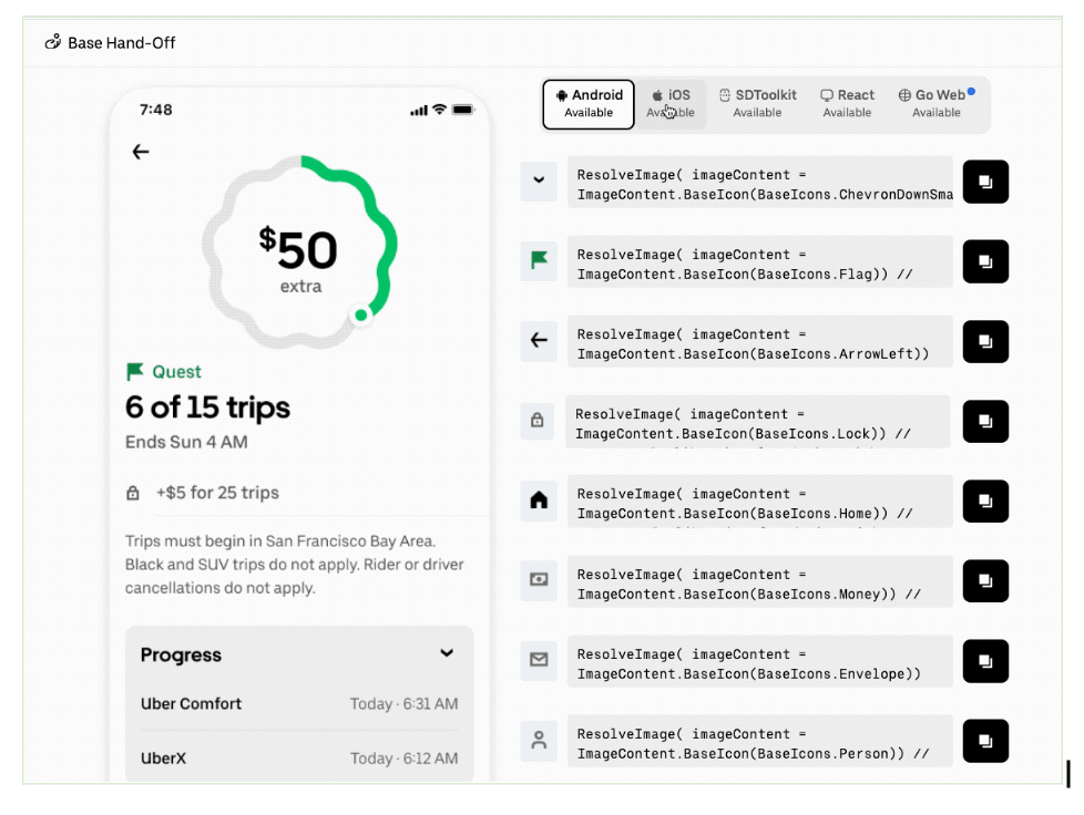
Most importantly, we developed the tooling to make updates seamless across design files and code, a core strength of our team at Uber. Seeing a single cohesive icon system come to life across our apps was a moment of joy, and a reminder that design systems succeed when we listen. When two products drifted apart, it wasn’t failure, it was feedback. It helped us rebuild with more empathy, scalability, and precision.
Our key takeaways
Seeing a single cohesive icon system come to life across our apps was a moment of joy, and a reminder that design systems succeed when they listen. When two products drifted apart, it wasn’t a failure. It was feedback. And that feedback helped us rebuild with more empathy, more precision, and a clearer understanding of what scale demands.
This work left us with four principles we'll carry forward:
- Design to scale. What feels bold and distinctive across 50 icons today must remain legible and flexible when the library grows to 1,500 and beyond. Build for where you're going, not just where you are.
- Design for clarity. Treat icons as a universal visual language that helps people navigate the world around them, every shape should earn its place by making the next step obvious. Clarity leads to confidence and builds trust.
- Design for accessibility. Diverse needs aren't edge cases. Keep users’ needs at the center.
- Design with data. Ground guidelines in real-world learning, not assumptions, just as our Driver team did by testing legibility in context instead of relying on instinct alone.
I’ve always believed that good design should be practical, serve the business, be accessible, and be beautiful, and that none of those should come at the expense of another. It’s a difficult balance, but that’s the job. This project was our effort to hold all of those together, and I believe the team delivered.
This project was our effort to hold all of those together, and I believe the team delivered.
Because in the end, good iconography doesn’t just decorate and describe movement, it powers it.
More of our work
Designing for smart food photography
Real-time feedback that brings clarity, confidence, and quality to user photos
View work
Reimagining the driver experience
How a design-led initiative brought focus, clarity, and confidence back to the Driver app
View work
Elevating the earner experience
A new visual language for our heatmap
View work
Designing batched shopping orders
Redesigning shopping trips to enable a batched experience for earners
View work
Design specs, reimagined
How Uber Built an Agentic System to Automate Design Specs in Minutes
View work
Uber Design
2026 © Uber Technologies Inc.
When to evolve a design system
Rebuilding Uber’s icon language
Samira Rahimi
Group Product Design Manager, Base
25 March 2026
Every day, millions of people navigate Uber’s apps with the help of icons. They may be small, but they play an important role in the interface: ensuring clarity, helping riders find their way, keeping drivers informed, and letting customers follow their orders. When they work well, they create clarity, continuity, and trust across the experience. When that breaks down, the signal becomes impossible to ignore.
Over the past year, our Base design system team turned those signals into action, rebuilding Uber’s icon library to restore clarity, accessibility, and consistency across our global platform, while creating a more scalable visual language and a stronger design-to-code pipeline.
The language of navigation
Think about the last time you opened an app in a hurry. You didn’t read. You scanned. You looked for icons, colors, and familiar cues to get where you needed to go.
But for some users, icons aren’t just a shortcut, they’re the primary way to understand what’s happening and what to do next. A clear icon sets the right expectation and carries the entire meaning of an interaction without relying on text. Just a shape that says: go here, tap this, you’re on track. When that clarity breaks down, the people who rely on icons most are the first ones left behind.
Uber’s bold, minimal brand once relied on a tightly crafted icon set featuring 3px outlines, sharp corners, and a confident, geometric rhythm. It served us well for years. But as our products grew and new use cases emerged, what once worked beautifully began to show its limits at scale.
Listening to the signal
One of the hardest questions in design systems is knowing when it’s time to evolve. Our view is simple: when two or more products begin to diverge from the system, it’s no longer drift—it’s feedback. And that’s when the system team needs to listen and act.
The scaling challenge
As the company grew, new products, features, and platforms demanded hundreds of additional icons. At that scale, the limitations of our 3px outline style became impossible to ignore. There simply weren’t enough pixels to express complex ideas with precision. Details became cramped, shapes lost clarity, and icons began to feel heavy on screen.
To preserve legibility, we leaned into filled icons as the default. They offered more control and visual clarity. But over time, relying on a single filled style introduced new accessibility challenges, especially when distinguishing between default and selected states. Because Uber’s brand color is black, the state change relied on shifting from gray to black, a contrast too subtle for many users to notice.
Some apps continued using only filled icons, while others reverted to outlines as their default. Over time, consistency, and the trust it builds, started to fray. When two of our biggest products began speaking different visual languages, we knew a small adjustment wouldn’t be enough.
At that point, the signal was impossible to ignore: this wasn’t a tweak, it was a redesign. The scope was massive, but the goal was clear. We decided to start fresh—not just to adjust stroke thickness, but to give our icons a shared voice again, one that felt lighter, clearer, more open, and built to scale across every journey at Uber.
A shared voice
The goal was about defining a visual language that could scale with Uber. Inspired by our very own Uber Move typeface, we wanted icons and typography to feel like they belonged to the same family. They should be clear, confident, and unmistakably Uber. We began to think of them as two expressions of one visual alphabet. The typeface’s sharp structure, open counters, and generous use of space gave us a direction: create icons that felt lighter, more breathable, and more at ease across the growing breadth of Uber’s products.
To translate that direction into a system, we defined a set of core principles:
- 2px stroke weight for a lighter visual presence and more refined detail
- Square stroke caps to echo the crisp precision of our type
- Generous negative space to create a more breathable, balanced structure
- Exaggerated roundness to turn corners into a distinctive design feature
- A geometric foundation softened with gentle curves where needed
- Organic forms, where appropriate, to better express modern digital experiences
This is more than a style update. We resolved long-standing accessibility challenges by defining a precise relationship between filled and outlined states, sharpening both quality and clarity for all kinds of users.
The unified direction scales across our entire portfolio, closing the gap between divergent styles and eliminating technical debt.
Production at scale
Then came the heavy lifting: A massive effort to redesign 1,500 icons in under four months. We built a new library, introduced a consistent naming and sizing system, and developed detailed guidelines for creation and use.
Most importantly, we developed the tooling to make updates seamless across design files and code, a core strength of our team at Uber. Seeing a single cohesive icon system come to life across our apps was a moment of joy, and a reminder that design systems succeed when we listen. When two products drifted apart, it wasn’t failure, it was feedback. It helped us rebuild with more empathy, scalability, and precision.
Our key takeaways
Seeing a single cohesive icon system come to life across our apps was a moment of joy, and a reminder that design systems succeed when they listen. When two products drifted apart, it wasn’t a failure. It was feedback. And that feedback helped us rebuild with more empathy, more precision, and a clearer understanding of what scale demands.
This work left us with four principles we'll carry forward:
- Design to scale. What feels bold and distinctive across 50 icons today must remain legible and flexible when the library grows to 1,500 and beyond. Build for where you're going, not just where you are.
- Design for clarity. Treat icons as a universal visual language that helps people navigate the world around them, every shape should earn its place by making the next step obvious. Clarity leads to confidence and builds trust.
- Design for accessibility. Diverse needs aren't edge cases. Keep users’ needs at the center.
- Design with data. Ground guidelines in real-world learning, not assumptions, just as our Driver team did by testing legibility in context instead of relying on instinct alone.
I’ve always believed that good design should be practical, serve the business, be accessible, and be beautiful, and that none of those should come at the expense of another. It’s a difficult balance, but that’s the job. This project was our effort to hold all of those together, and I believe the team delivered.
This project was our effort to hold all of those together, and I believe the team delivered.
Because in the end, good iconography doesn’t just decorate and describe movement, it powers it.
More of our work
Designing for smart food photography
Real-time feedback that brings clarity, confidence, and quality to user photos
View work
Reimagining the driver experience
How a design-led initiative brought focus, clarity, and confidence back to the Driver app
View work
Elevating the earner experience
A new visual language for our heatmap
View work

Designing batched shopping orders
Redesigning shopping trips to enable a batched experience for earners
View work
Design Specs, Reimagined
How Uber Built an Agentic System to Automate Design Specs in Minutes
View work
Uber Design
2026 © Uber Technologies Inc.
When to evolve a design system
Rebuilding Uber’s icon language
Samira Rahimi
Group Product Design Manager, Base
25 March 2026
Every day, millions of people navigate Uber’s apps with the help of icons. They may be small, but they play an important role in the interface: ensuring clarity, helping riders find their way, keeping drivers informed, and letting customers follow their orders. When they work well, they create clarity, continuity, and trust across the experience. When that breaks down, the signal becomes impossible to ignore.
Over the past year, our Base design system team turned those signals into action, rebuilding Uber’s icon library to restore clarity, accessibility, and consistency across our global platform, while creating a more scalable visual language and a stronger design-to-code pipeline.
The language of navigation
Think about the last time you opened an app in a hurry. You didn’t read. You scanned. You looked for icons, colors, and familiar cues to get where you needed to go.
But for some users, icons aren’t just a shortcut, they’re the primary way to understand what’s happening and what to do next. A clear icon sets the right expectation and carries the entire meaning of an interaction without relying on text. Just a shape that says: go here, tap this, you’re on track. When that clarity breaks down, the people who rely on icons most are the first ones left behind.
Uber’s bold, minimal brand once relied on a tightly crafted icon set featuring 3px outlines, sharp corners, and a confident, geometric rhythm. It served us well for years. But as our products grew and new use cases emerged, what once worked beautifully began to show its limits at scale.
Listening to the signal
One of the hardest questions in design systems is knowing when it’s time to evolve. Our view is simple: when two or more products begin to diverge from the system, it’s no longer drift—it’s feedback. And that’s when the system team needs to listen and act.
The scaling challenge
As the company grew, new products, features, and platforms demanded hundreds of additional icons. At that scale, the limitations of our 3px outline style became impossible to ignore. There simply weren’t enough pixels to express complex ideas with precision. Details became cramped, shapes lost clarity, and icons began to feel heavy on screen.
To preserve legibility, we leaned into filled icons as the default. They offered more control and visual clarity. But over time, relying on a single filled style introduced new accessibility challenges, especially when distinguishing between default and selected states. Because Uber’s brand color is black, the state change relied on shifting from gray to black, a contrast too subtle for many users to notice.
Some apps continued using only filled icons, while others reverted to outlines as their default. Over time, consistency, and the trust it builds, started to fray. When two of our biggest products began speaking different visual languages, we knew a small adjustment wouldn’t be enough.
At that point, the signal was impossible to ignore: this wasn’t a tweak, it was a redesign. The scope was massive, but the goal was clear. We decided to start fresh—not just to adjust stroke thickness, but to give our icons a shared voice again, one that felt lighter, clearer, more open, and built to scale across every journey at Uber.
A shared voice
The goal was about defining a visual language that could scale with Uber. Inspired by our very own Uber Move typeface, we wanted icons and typography to feel like they belonged to the same family. They should be clear, confident, and unmistakably Uber. We began to think of them as two expressions of one visual alphabet. The typeface’s sharp structure, open counters, and generous use of space gave us a direction: create icons that felt lighter, more breathable, and more at ease across the growing breadth of Uber’s products.
To translate that direction into a system, we defined a set of core principles:
- 2px stroke weight for a lighter visual presence and more refined detail
- Square stroke caps to echo the crisp precision of our type
- Generous negative space to create a more breathable, balanced structure
- Exaggerated roundness to turn corners into a distinctive design feature
- A geometric foundation softened with gentle curves where needed
- Organic forms, where appropriate, to better express modern digital experiences
This is more than a style update. We resolved long-standing accessibility challenges by defining a precise relationship between filled and outlined states, sharpening both quality and clarity for all kinds of users.
The unified direction scales across our entire portfolio, closing the gap between divergent styles and eliminating technical debt.
Production at scale
Then came the heavy lifting: A massive effort to redesign 1,500 icons in under four months. We built a new library, introduced a consistent naming and sizing system, and developed detailed guidelines for creation and use.
Most importantly, we developed the tooling to make updates seamless across design files and code, a core strength of our team at Uber. Seeing a single cohesive icon system come to life across our apps was a moment of joy, and a reminder that design systems succeed when we listen. When two products drifted apart, it wasn’t failure, it was feedback. It helped us rebuild with more empathy, scalability, and precision.
Our key takeaways
Seeing a single cohesive icon system come to life across our apps was a moment of joy, and a reminder that design systems succeed when they listen. When two products drifted apart, it wasn’t a failure. It was feedback. And that feedback helped us rebuild with more empathy, more precision, and a clearer understanding of what scale demands.
This work left us with four principles we'll carry forward:
- Design to scale. What feels bold and distinctive across 50 icons today must remain legible and flexible when the library grows to 1,500 and beyond. Build for where you're going, not just where you are.
- Design for clarity. Treat icons as a universal visual language that helps people navigate the world around them, every shape should earn its place by making the next step obvious. Clarity leads to confidence and builds trust.
- Design for accessibility. Diverse needs aren't edge cases. Keep users’ needs at the center.
- Design with data. Ground guidelines in real-world learning, not assumptions, just as our Driver team did by testing legibility in context instead of relying on instinct alone.
I’ve always believed that good design should be practical, serve the business, be accessible, and be beautiful, and that none of those should come at the expense of another. It’s a difficult balance, but that’s the job. This project was our effort to hold all of those together, and I believe the team delivered.
This project was our effort to hold all of those together, and I believe the team delivered.
Because in the end, good iconography doesn’t just decorate and describe movement, it powers it.
More of our work
Designing for smart food photography
Real-time feedback that brings clarity, confidence, and quality to user photos
View work
Reimagining the driver experience
How a design-led initiative brought focus, clarity, and confidence back to the Driver app
View work
Elevating the earner experience
A new visual language for our heatmap
View work
Designing batched shopping orders
Redesigning shopping trips to enable a batched experience for earners
View work
Design Specs, Reimagined
How Uber Built an Agentic System to Automate Design Specs in Minutes
View work
Uber Design
2026 © Uber Technologies Inc.